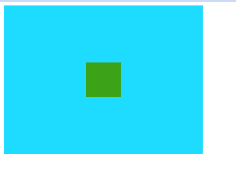
如上图,没有给任何位置设置.
// css
<style>
    .big {
        width: 400px;
        height: 300px;
        background-color: #1edcff;
    }

    .small {
        width: 70px;
        height: 70px;
        background-color: #3ca217;
    }
</style>

// html
<div class="big">
    <div class="small"></div>
</div>
要是小的div在大div里居中,有5种方式.
- flex
.big {
    width: 400px;
    height: 300px;
    background-color: #1edcff;

    display: flex;
    align-items: center;
    justify-content: center;
}- grid
.big {
    width: 400px;
    height: 300px;
    background-color: #1edcff;

    display: grid;
    place-content: center;
}
- position
.big {
    width: 400px;
    height: 300px;
    background-color: #1edcff;

    position: relative;
}

.small {
    width: 70px;
    height: 70px;
    background-color: #3ca217;

    position: absolute;
    top: 50%;
    left: 50%;
    transform: translate(-50%, -50%);
}- flex + margin
.big {
    width: 400px;
    height: 300px;
    background-color: #1edcff;

    display: flex;
}

.small {
    width: 70px;
    height: 70px;
    background-color: #3ca217;

    margin: auto;
}- grid + margin
.big {
    width: 400px;
    height: 300px;
    background-color: #1edcff;

    display: grid;
}

.small {
    width: 70px;
    height: 70px;
    background-color: #3ca217;

    margin: auto;
}
以上任意一种,都可以看到下面居中效果: